

Mastering Metal Business Card Design for Brand Systems
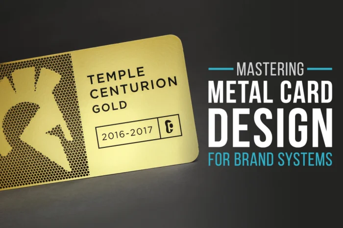
Design a Metal Business Card That Works Everywhere
A metal business card should not be a one-off party trick. When metal business card design is done right, it becomes a core part of your brand system, the same way your site, slide deck, and trade show booth are. As conference and trade show season picks up in the fall, that small piece of metal can carry a clear, consistent brand story into every handshake.
When we say “brand system,” we mean the full kit: logo, fonts, colors, materials, photography, motion, and how all of it shows up across print, digital, and physical space. A strong system keeps things clear and consistent so your team does not have to reinvent the wheel every time someone needs a card. Our focus here is simple: how to master metal business card design so it lines up with your larger brand, scales across your company, and feels easy to keep up over time.
We will keep the language simple, skip the design-school jargon, and break the process into calm, smart steps. Think of this as a guided walk through the decisions that create a premium, on-brand metal card you are proud to hand out at any event.
Start with Your Brand System, Not the Card
The best metal business card design does not start in the card template; it starts in your brand guidelines. If your brand system is clear, the card design becomes a set of obvious choices instead of endless guesswork.
First, pull together what already exists:
- Logo files and logo rules
- Brand color palette and how colors are used
- Typography choices for headlines and body copy
- Core phrases, taglines, or messages
From there, translate these into smart constraints for the card. Ask questions like:
- What is the minimum text size so it stays legible?
- How much clear space should sit around the logo and key text?
- Which one or two colors matter most for quick recognition?
- What has to appear on every card (name, title, URL, QR code, social handles)?
Next, audit your current materials. Look at your site, pitch decks, packaging, social profiles, and any event graphics. Then define 3 to 5 non-negotiables your metal business card design must echo so it feels like part of the same family. For example, you might lock in:
- One logo placement that never moves
- One primary brand color as the anchor
- One typeface for names and titles
- One layout rule for contact info
If your company has a marketing or design team, bring them in early. When they co-create the rules, approvals get smoother, timing gets clearer, and everyone feels ownership, especially when you are refreshing materials before a big fall launch or key trade show.
Designing for Metal, Not Just for Screen or Paper
Metal is not paper. It has its own strengths and limits, and leaning into those is where the difference shows.
With metal business card design, you are working with:
- Precision etching and engraving
- Cut-through shapes and negative space
- Spot color fills and gradients used sparingly
- Finishes like brushed, matte, or mirror
Digital proofs can show color and layout, but they do not fully capture depth, texture, and reflection. That is why we think about how your mark will live as a physical object. If your logo was born on a screen, it might need a metal-ready version. That often means:
- Simplifying super-fine lines that could fill in when etched
- Adjusting tiny details that disappear at small sizes
- Choosing a solid color version that still feels premium
Hierarchy also shifts on a metal business card design. On screen, you might rely on gradients, drop shadows, or bright color blocks. On metal, you get contrast from:
- Tactile depth from etching
- Negative space that lets the metal breathe
- Cutouts that frame a logo or guide the thumb where you want it
A few practical tips:
- Keep line weights a bit heavier than you think you need
- Use card edges and corners with intent, like aligning key elements to one edge
- Decide where you want cutouts to invite touch and where you want a quiet, smooth surface
Done well, the card feels like a small piece of product design, not just a small sign.
Building a Scalable System for Your Whole Team
Once your card looks dialed in, the next step is making sure it works beyond one person. A strong system turns “my card” into “our cards,” without constant redesign.
Think in terms of a template with two zones:
- Fixed brand elements: logo size and placement, finish, main color areas, background style
- Flexible fields: name, title, department, phone, email, QR code destination
This way, every card looks like it came from the same design brain, even when your team is spread across offices or regions. To keep things smooth, create a short style guide just for metal business card design. It can include:
- File types your team should provide for logos
- How names and titles are written (full name vs initials, title formats)
- Which finishes are approved for your brand
- Who signs off on final proofs
Think about timing and logistics too, especially as fall events stack up:
- Set lead times that give some cushion for large orders
- Plan reorder points before busy seasons so no one scrambles
- Decide when old designs should be retired so they do not linger in circulation
That quiet structure behind the scenes is what makes the brand feel polished on the show floor.
Extending Metal Beyond the Business Card
Once your metal business card design is locked in, it becomes a base for a full metal ecosystem. The same visual language can stretch into:
- Membership or loyalty cards
- Gift cards or VIP passes
- Event badges or staff IDs
- Luggage tags, bottle openers, or branded inserts
The key is to reuse the logic, not just the logo. Keep the same:
- Grid system for alignment
- Cut-out shapes and corner language
- Finish combinations for light and dark areas
- Type hierarchy for names, headings, and secondary details
Digital integration can layer on top of this. Adding QR codes or NFC allows that physical card to connect directly to landing pages, event apps, portfolios, or seasonal campaigns. The metal stays consistent in the hand, while the content behind the code can shift with your calendar.
During conferences, holiday promos, or year-end gifting, this metal system tells a steady story. Every piece feels related, calm, and intentional, instead of a set of disconnected ideas.
Turn Your Concept Into a Cohesive Metal System
To pull it all together, the path is simple: start from your brand system, design specifically for metal, build a template that scales, then extend that language into other metal products over time.
A quick checklist to ground your next steps:
- Audit your current brand touchpoints
- Define 3 to 5 non-negotiables your metal card must echo
- Choose finishes and color use that fit your brand, not just current trends
- Build a reusable template with fixed and flexible areas
- Map a short list of future metal pieces you might want to add
At My Metal Business Card, we live in this metal business card design space every day, from our studio in Southern California to events across the country. Our role is to translate brand guidelines into production-ready metal, help refine the small details, and keep the system clear as your team grows. With the right structure in place, every metal card you hand over this fall and long after will feel intentional, on-brand, and memorable in a quiet, confident way.
Transform Your Networking With Premium Metal Business Cards Today
Elevate every introduction with a custom card that reflects the quality and personality of your brand. Explore our metal business card design options to choose the material, finish, and details that match your vision. At My Metal Business Card, we work with you to refine every element so your cards make a lasting impression. Have questions or need help getting started? Just contact us and our team will guide you through the process.