

Black Metal, High Contrast: Readability & Accessibility for Business Cards
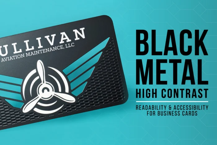
Make Black Metal Business Cards That Actually Get Read
Black metal business cards look dramatic, feel solid, and get a reaction the second they leave your hand. But if people have to squint to read your name, the moment falls flat. The point of a premium card is to start a real connection, not just show off the finish.
That is where readability and accessibility come in. When the design is clear, your card works for tired eyes, dim hotel ballrooms, and quick pass-offs at the bar after a long conference day. Drama is welcome, but discipline is what gets your email saved and your number actually used.
In this guide, we are talking about that mix: bold black metal with smart typography, real contrast ratios, glare control, and low-light legibility. You will see what kind of fonts hold up, how finishes change what people can read, and straightforward rules that keep your card sharp in every kind of light. This is the kind of design thinking we work with every day at My Metal Business Card, and we will keep it clear, not clinical.
Why Black Metal Business Cards Need Extra Discipline
Black metal is not like white card stock. On a dark surface, you do not get free contrast. Every letter depends on how the light hits the metal, what finish you choose, and how light or dark your ink or reveal really is. If you miss, your text can simply disappear into the background.
Think about where you actually hand out cards: soft lighting in hotel ballrooms, overhead LEDs in convention centers, rooftop events in warm late-summer air, or narrow airplane cabins on the way home. All of these spaces are demanding for dark cards. You get glare, odd shadows, and tired eyes.
Some common issues on black metal cards are:
- Ultra-thin, hairline fonts
- Tiny contact details that look sharp only on a big screen
- Tone on tone engraving that photographs well but is hard to read in person
Accessibility is not a compromise; it is an advantage. When you design so that more people can read your card quickly, you help everyone: people with weaker vision, people wearing the wrong glasses that day, and people simply exhausted after eight hours of conversation.
High-Contrast Typography That Works in Low Light
The right font on black metal business cards is like a good suit: simple, clean, and made to move. Humanist sans-serif fonts and clear, sturdy serifs usually beat ultra-minimal or super-condensed styles. Those very thin, ultra-light fonts that work in a logo can fall apart once they are laser etched or printed at small sizes.
A strong card uses hierarchy so the eye knows where to land. As a starting point:
- Your name should be the largest and boldest element
- Your title should be smaller but still clear at arm’s length
- Core contact info, like phone, email, and main link, should sit in a clean block with space to breathe
Stroke weight matters a lot on metal. Lines that are too light can fade or break when produced. Small text like email addresses or URLs usually needs a bit more weight and a slightly larger point size than you might use in paper designs. What looks acceptable on a backlit screen often needs a size bump to stay crisp on the surface of black metal business cards.
Also remember the timing of most events. Late-summer conferences, end-of-year planning sessions, and evening networking often mean warm, dim lighting. Your typography has to handle yellow-tinted bulbs, candlelight, and bar LEDs. When in doubt, go one step larger, one step heavier, and give each line more breathing room than you think you need.
Contrast Ratios and Finishes That Work in the Real World
On screens, designers talk about contrast ratios and WCAG rules. Off screen, the principle is the same: light elements must be light enough, dark elements must be dark enough, and the gap between them must be clear at a glance.
On black metal business cards, you usually have a few strong contrast tools:
- Raw metal reveal with silver laser etching, a silver or stainless tone against the black
- White or light color inks that stand out from the surface
- Bright spot colors with enough vibrancy to stay legible
A helpful rule of thumb: for small text, go light on dark. Think white ink, bright colors, or raw metal reveal against the black card. For logos, monograms, or large initials, you can use deeper engraving or darker inks, because scale is doing some of the work.
At My Metal Business Card we like to test contrast in practical, real ways. We look at cards from arm’s length, from across a table, and at quick-glance speed, the way someone would glance down mid-conversation. We tilt cards under different angles and ask a basic question: can we read the key details in one look, without squinting or hunting?
Designing Black Metal Cards for Clear, High-Impact Contrast
Black metal business cards already have one major advantage when it comes to readability: contrast. The matte black surface creates a strong backdrop for silver laser etching, lighter spot colors, and clean design elements that stand out immediately.
Silver laser etching is one of the most effective options for important information such as your name, title, phone number, email address, and website. Against the black finish, the etched metal creates a crisp contrast that feels premium without needing an overly complicated design.
Spot colors can also be used to bring attention to specific parts of the card. A brand color in a logo, icon, border, or small accent can create visual hierarchy while allowing the silver etching to handle the information that needs to stay easiest to read.
The key is not to make every part of the card compete for attention. Black metal tends to look strongest when the design is intentional and restrained. A few elements that work especially well include:
- Silver laser-etched contact information
- High-contrast logos and typography
- Spot color accents for important brand details
- Surface-etched patterns used as background elements
- Custom cutouts that add interest without crowding the layout
- Simple spacing that gives names and contact details room to stand out
Surface etching can add another layer of detail without relying on additional color. Patterns, textures, or larger graphic elements can be etched into the black surface to create a subtle tonal effect, while brighter silver etching or spot colors remain the visual focus.
This is also where hierarchy matters. Your logo may be the first thing someone notices, but the card still needs to make your contact information easy to find. Give your name and essential details enough size, weight, and open space that they do not get lost among decorative elements.
Black metal does not need a busy layout to feel premium. In many cases, the matte black finish, a clean logo, sharp silver etching, and one carefully chosen accent are enough to create a card that feels distinctive and is easy to read.
Turn Your Black Metal Business Cards Into a Working Asset
Premium black metal business cards should not just sit there looking refined. It should work like a small, well-designed tool you can trust. High contrast, smart typography, and low-light legibility all push your card from “nice touch” to a reliable, quietly effective asset.
If you already have black metal business cards, hold one under the kind of lighting you find at late-summer events and fall conferences. Ask yourself:
- Is my name readable in one glance?
- Does my phone or email stay clear at different angles?
- Are any parts polished but hard to read in low light?
From there, you can decide what needs to change, like font weight, point size, contrast choice, or finish. At My Metal Business Card we design and refine black metal cards every day, so if you want a card that looks dramatic and reads effortlessly in real life, we are ready to help.
Stand Out Instantly With Premium Black Metal Cards
Make your next introduction unforgettable with custom black metal business cards crafted to match your brand. At My Metal Business Card, we laser cut, etch, and finish every card with precision so your details look sharp and professional. Ready to bring your design to life or need help creating one from scratch? Reach out to us through our contact page and we will guide you every step of the way.