

Status Signals in Metal Business Card Design (Without Looking Flashy)
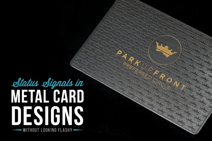
Quiet Power: What Your Card Says Before You Speak
A business card is more than contact information. It is a tangible signal of how you work. The finish, thickness, weight, and any cutouts all tell a quiet story before anyone reads your name. When those details are chosen with care, your card feels confident, calm, and considered without demanding attention.
This matters most in high-stakes moments. Big Q3 or Q4 pitches, late-summer conferences in crowded hotels, and end-of-year planning meetings all move fast. You may only get a few seconds to be remembered. Premium metal business cards can say: we are prepared, we invest in details, and we are here for the long term.
The real strength is restraint. Presence rarely comes from loud colors and tricks. It comes from choices that feel intentional, simple, and aligned with your brand, over and over again.
Finish: the First Impression Your Brand Wears
Finish is the surface your brand presents every time your card changes hands. It sets the mood before anyone looks at your logo.
Here is what different finishes for premium metal business cards often signal:
- Matte: Quiet, modern, minimal, very controlled
- Brushed: Professional, steady, slightly industrial, ideal for practical brands
- Natural: Smooth, refined, a soft glow without glare
- Shiny/Mirror: Bold, high-energy, sharp, more reflective
In busy networking spaces, lighting is rarely ideal. You get bright overhead LEDs, mixed window light, and the glow from projectors. A finish that photographs well and avoids harsh glare helps your card look good in real life, and in quick phone shots for later.
A few simple guidelines help your finish feel refined and authentic to your brand:
- If your logo is simple and geometric, a satin or matte finish lets the forms stay clear and focused
- If your brand is more rugged or industrial, brushed metal feels honest and grounded
- If you use bold colors, pair them with a more understated finish so the card feels balanced from every angle
Our design team spends time balancing these elements so your premium metal business cards look like a natural extension of your brand, not an add-on.
Thickness and Weight: the Subtle Signal of Substance
People notice thickness and weight even if they never name it. When someone takes a metal card from your hand, that slight pause from the extra weight creates a quiet sense of substance.
Standard thickness often works well for:
- Everyday networking events
- Trade shows with heavy foot traffic
- Team cards that need to be carried constantly
A heavier, ultra-premium thickness is best reserved for higher-stakes situations:
- Founders and partners who lead key meetings
- Luxury services or high-value consulting engagements
- Investor meetings or board-level conversations
You can treat thickness the way you treat watches or shoes. You might have a reliable daily option, then a few elevated pieces for bigger moments. Heavier premium metal business cards do not need to be handed out to everyone. Reserve them for the introductions you most want to reinforce: top prospects, VIP clients, or those rare contacts that feel important from the start.
Cutouts: Precision Details That Whisper Quality
Cutouts and custom shapes are where metal truly stands out. Precise cut details, etched patterns, or open windows in the design can signal innovation and craftsmanship. Used thoughtfully, they say: we care about how things are made.
To keep cutouts feeling purposeful, not distracting:
- Let one main cutout or pattern lead, rather than many competing shapes
- Keep the overall silhouette mostly classic so the card still feels solid in the hand
- Use cutouts to highlight something true about your brand, such as precision, openness, or technical expertise
At our U.S. shop, we engineer designs so even intricate cutouts feel sturdy and smooth to the touch, never fragile or sharp.
Color, Contrast, and Logo Placement That Stay Composed
Color on metal is powerful, and easy to overuse. Restrained palettes almost always feel more elevated.
Think in terms of:
- One primary brand color
- One supporting color if needed
- Metal acting as the neutral base
Thoughtful contrast keeps your details readable in a dim hotel bar or a bright conference hall. Clear contrast between text and background looks polished in person and photographs crisply for LinkedIn updates or quick contact snaps.
Logo, name, and title placement should give the design room to breathe. White space is not wasted space; it is a quiet signal that you are focused on essentials, not trying to say everything at once.
To keep the layout calm and clear:
- Anchor the logo in one strong position, top or center, and keep it consistent
- Use one primary font family, relying on weight and size changes instead of multiple typefaces
- Limit visual effects like heavy gradients, drop shadows, or busy patterns
Our designers specialize in taking crowded ideas and refining them into premium metal business cards that feel timeless and versatile, from hot summer trade shows to year-end boardroom meetings.
How to Build a Premium Card System That Feels Effortless
Think of your premium metal business cards as a focused kit. You do not need dozens of versions, just the right options for the right setting.
A simple metal card system might include:
- A core card: your everyday premium metal business cards aligned with your main brand look
- A VIP version: thicker, possibly with edge paint or a distinct finish for key relationships
- Event-specific runs: small batches with slight tweaks for a major conference or product launch
Designing quietly confident and premium metal business cards can be as straightforward as following this order:
1. Define your brand vibe in a sentence or two, such as calm and precise or bold and tech-forward
2. Choose a finish and thickness that match that feeling
3. Add one or two hero details, such as a cutout, or a unique etched pattern
4. Remove anything that does not serve clarity and feel
At My Metal Business Card, we pair white-glove design support with rapid production options, so putting this system in place before busy fall trade shows or year-end client gifting stays smooth and low-friction.
Make Your Next First Impression Work All Year
Look at the cards you hand out right now. Do they reflect where your business is today? Are they expressing the stability, taste, and intention you want people to sense when you slide a card across the table?
Gather your logo files, brand colors, and a short note about your ideal client. From there, our team at My Metal Business Card can help translate those details into premium metal business cards that speak with quiet confidence. With the right finish, thickness, cutouts, and layout, your card can say more with less, long after the handshake is over.
Get Started With Your Project Today
Bring your first impression to life with premium metal business cards that reflect the quality of your brand. At My Metal Business Card, we work with you to create custom designs that fit your style, industry, and goals. If you have questions or need help getting started, just contact us and our team will guide you through every step. Let us help you stand out at your next meeting, event, or presentation.